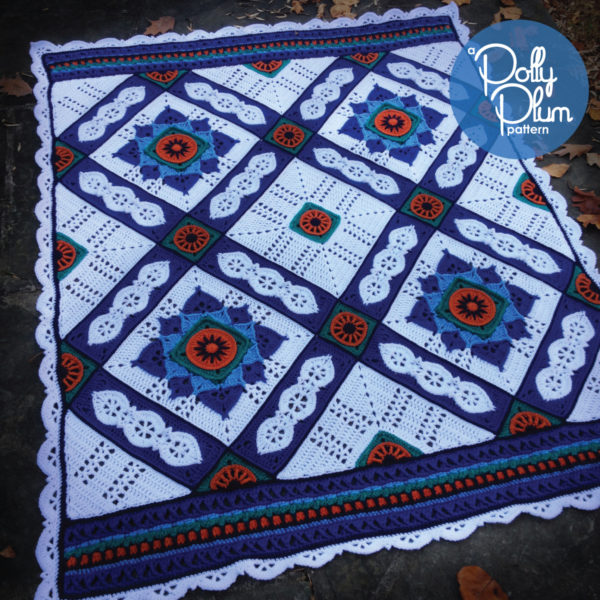
Welcome to my first installment of information for the A Day at the Grand Bazaar CAL Lite which will officially begin on January 20th and will be held in the Facebook group called Polly Plum Pattern Posse. Please come join us for lots of crochet fun. It’s also the best place to go for pattern support.
The very first thing I want to talk about is color.
Color.
You’re either super excited about that or dreading the many decisions in your future. If you feel confident about picking your colors for this project then go crazy. This post and the next are going to be specifically for those of us (myself included) who struggle to pick colors, or those of you who would like to learn more about how to identify what you like about a crochet project and apply it to your own work.
Don’t get me wrong, I’m pretty proud of some of my color choices and I get the occasional compliment on my color selections. I’m also pretty proud of the grade (A!) I got in color theory class. But the truth is that I struggle. As much as I understand the theory and science of color, making artistic color choices is a whole other thing. When it comes to picking colors for a new project, well, you’d think I was picking out an outfit for a first date. Imagine yarn and swatches strewn around the room like dresses and high heels.
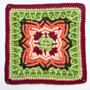
Color Win.
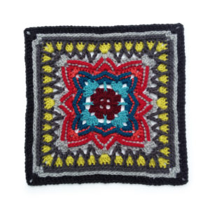
Color WTF.
One of the main problems I’ve noticed that I have is not so much selecting a nice palette, but selecting the appropriate placement of my chosen colors in the actual crochet pattern. (Do these shoes go better with this dress? Or these ones?)
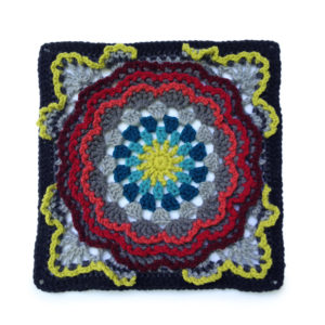
Same palette as the WTF above, but here somehow I completely nailed it.
Therefore, I’m proposing we explore a new kind of color selection and placement process where we will “borrow” what is essentially the formula of another expert crocheter’s afghan. I’ve taken 5 Grand Bazaar afghans that have already been made (or are in the process) and thoroughly studied their colors and broken them down into some basic instructions to help you apply the same principles to your preferred colors with the goal of making something uniquely yours but inspired by someone else’s work.
I think the best part about using this afghan to explore this crazy idea of mine is that it works so well in just 5 or 6 colors. Why is that so great? Because most of the color palette blogs you’ll surf through on the internet include palettes of just 5 or 6 colors. Yes, we’re going to explore how to apply that type of color inspiration to our work in a really useful, non-floundering way.
Ready to see what I mean?
Formula A: My Colors, as in the pattern
Let’s start with the afghan I made. I’m pretty happy with it and the colors and placement I chose. It’s high contrast and certainly makes a statement.
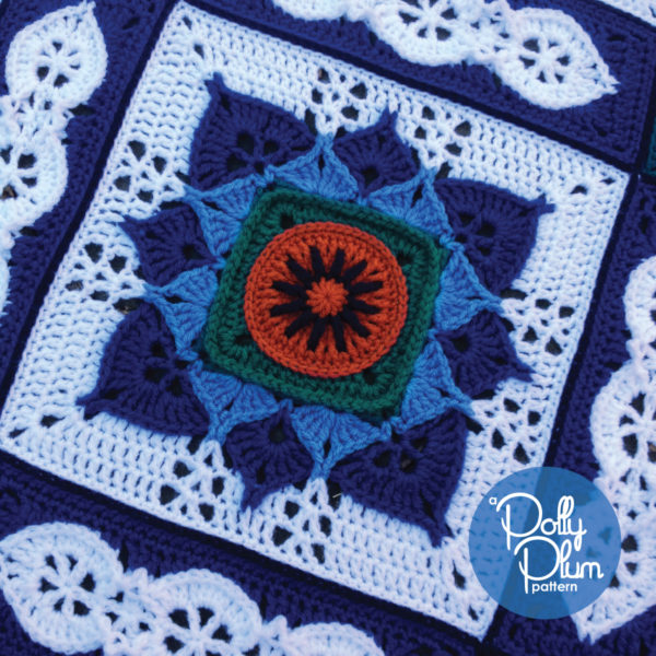
I’ll start by explaining the color theory behind the afghan, which, don’t worry, doesn’t need to make sense to you. But, if you have a basic knowledge of color theory may be helpful.
Color Theory: This palette is centered around a single color (blue in my case) then accented with an analogous color (C, teal) and a complementary color (A, orange), and uses white as a background.
Now let’s look at that in simpler terms and an explanation of how to pick colors for this formula.
Color Easy: Basically you pick your main color (I pick blue! Yay! That was easy. Now you pick one.) and pick a light (D), medium (E), and very dark (B) shade of that color. Now pick a color that’s super high contrast to your main color (A). Now pick a color that’s kind of similar to your main color but mostly just looks nice with what you’ve already picked and is different but not high contrast (C). Now pick a very light background color (F).
Remember: pick colors you like, not just ones that fit the formula. Let the formula guide you, not control you.
Here’s how I listed the formula in the pattern (page 5):
Color A – your brightest color, go for high contrast
Color B – a darker/darkest shade of color E
Color C – get creative, anything that looks nice with your other colors and looks great against color A
Color D – a lighter shade of color E
Color E – your main color, pick something you love
Color F – a very light color for the backgrounds, the centers of motif B, and the border
For this formula, use the color placement that is listed in the pattern. (For the next formulas I will give you a new guide for color placement as they are not made using the same placement in the pattern.)
Formula A in action
Ok, that was a lot of explaining. So how do we use it? There are two ways.
Your first option is to just jump in and pick some colors. This is good if you already have an idea of what you want. I’ll give it a go right now…
- For my main color I choose green. How about a light sage (D), a medium sage (E), and a nice dark forest green (B). I’m pretty sure Red Heart Super Saver makes some really nice greens that would work for this.
- Now I need a high contrast color (A). How about a rich cranberry red? Yes, this is coming together nicely.
- Now I need another color (C). Something that looks nice with sage and cranberry. I think I’m going to push this a little and pick a nice golden honey brown. That’s a little different that what the formula calls for, but it looks so nice together I just can’t resist. Furthermore, this color is going to be easy to change on the fly. When I actually have my greens and red picked out I can be flexible about this color.
- For my background color I think I’ll choose a cream or off-white.
Here’s about what I’ve come up with:
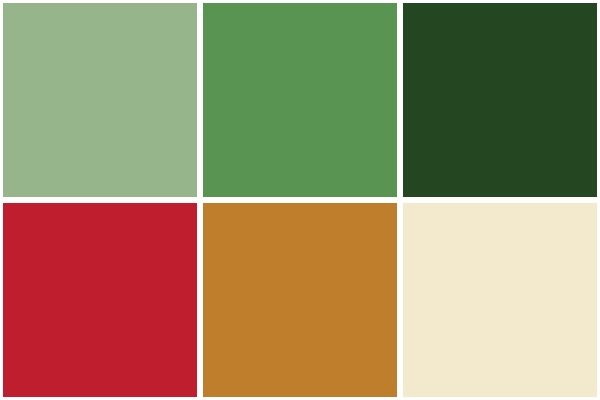
Now that I have an idea of what I want, I’ll go to my stash or the yarn store and pick some greens and see what red and brown I like with them.
This afghan will come out very green with pops of red showing first, then golden brown accents noticed second.
What do you think? That’s easy enough to do, right?
Now let’s look at your second option, how to use this formula with an already composed palette you found online.
Here’s a palette I found on design-seeds.com that I really like and I think it will work with this formula (one of the challenges I think we’ll face is matching palettes we like to formulas). To look for palettes for this formula look for ones that contain a greater variety of colors and have a good amount of contrast. I’ve noticed lots of palettes contain very similar colors without a lot of contrast. So look for the ones that stand out for having multiple colors.
I see this palette has three browns in it. Two are quite light and one is a dark coffee color. That’s okay, this will work. I’ll probably pick a medium shade that’s darker than the one in the palette. I use Lion Brand Vanna’s Choice a lot so I think I will put together a palette with that yarn.
Here’s my browns: Beige (D), Honey (E), Chocolate (B).
I’m going to use Vanna’s Cranberry for the red and make that color (A).
I’m going to use the medium blue for color (C) and I think I’ll use Vanna’s color Dusty Blue.
Finally, for my background (F), I might go with Vanna’s Silver Blue. It’s a very light blue that may or may not look great here. Some decisions have to be made on the fly and I think this is going to be one of them. I’ll keep a nice off-white like Linen on hand in case I change my mind about this one. Vanna’s Choice also has a new Pale Grey that might do the trick here. I guess it’s time for me to work up a sample motif A so that I can finalize these decisions.
{Picture of swatch sticks coming soon! I’m still working between home and a temporary office.}
This is going to be a warm brown afghan with pops of red seen first and accents of blue seen second.
So there you have it. We’ve broken down what I did with my original afghan and used the idea to create two new and completely different palettes that, I think, will make beautiful afghans.
Please, please, let me know what you think of choosing colors this way and if it’s helpful. Over the next few days I’ll be putting together similar formulas for afghans made by other crochet artisans with exceptional color picking abilities. These will have different color placements from my own and therefore give you more options and ideas.
Until next time…
Crochet on.
Crochet strong.


Thank you for this post. I think your colour choices are stunning (I’ve looked on Ravelry) and I’m terrified of colour and seem to be disastrous at choosing a pleasing palette! This is a good solid formula I can work from and hopefully it will transform my crochet, knitting, weaving and drawing. Thank you.