Welcome back to more color placement fun! We’re looking at Ravelry user afghans and getting inspired by their masterful color choices in preparation for the Grand Bazaar CAL Lite that begins on Friday (January 20th). Why did I pick inauguration day (US) to begin the CAL? No idea! I apparently wasn’t paying attention. But, we’ll get started regardless. Join the fun over in the Polly Plum Pattern Posse Facebook group and pick up your pattern for A Day at the Grand Bazaar afghan on Ravelry or Etsy. Moving on…
The second Grand Bazaar color placement layout we’re going to look at is this beauty by Ravelry user Taemombo. (Used with permission. Click here to see Taemombo’s Ravelry project page for this afghan.) This afghan is perfect if you love pops of color on a neutral background. The bursts of color are controlled and organized without being overly repetitive. (If you haven’t yet, read my first post about picking palettes. It explains what we’re doing here.)
Think outside of the box tip: You don’t have to use neutrals for your background. If you like tons of color, this could be a very fun layout to play with. Imagine 3 shades of blues for a deeply calming composition. Or maybe 3 shades of pink forming the base of a fun and funky afghan.
Now, let’s break this baby down.
Color theory: You have a lightest shade of a neutral, a medium shade, and a darkest shade. Two colors, non-analogous and not complementary (blue and red), add pops of color.
Color easy: Choose two colors you love together. They can be anything. The sample afghan uses two primary colors (red and blue) for a stronger effect, but you can soften it by choosing colors that are more similar to each other – say blue and green, or yellow and orange – or maximize on it by choosing two complementary colors – orange/blue, red/green/ or purple/yellow. One of those two colors becomes color (C). Pick two shades medium to light, of the other color – the brighter of the two becomes color (A) and the softer one becomes color (E). Finally, choose three neutrals in very different shades – one very light (F), one medium (D), and one the darkest you can find or just use black (B). Grey, taupe, or tan will all work here. Choose neutrals that you like with your colors.
Colors used in photo (all Lion Brand Vanna’s Choice yarn):
- A – Sapphire
- B – Black
- C – Cranberry
- D – Taupe
- E – Dusty Blue
- F – Linen
Formula for choosing your colors:
- A – One shade of your main color
- B – A darkest neutral
- C – Your second color
- D – A medium neutral
- E – A second shade of your main color
- F – A lightest neutral
Color in Action
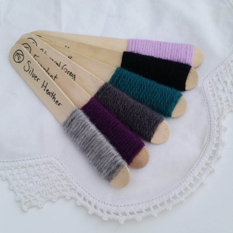
From the top of my head: I love grey. It’s a weird obsession with one of the most drab colors you can pick. But I love it. So I’m going to start with my neutrals and choose 2 shades of grey and use black for my darkest neutral. Next, I just adore teal with grey, so I’m going to pick a nice rich teal to be color C. Now, I’m thinking about what I love with teal. I love almost everything with teal. How about purple? Teal, purple and grey is a great combo. So I’ll choose two shades of purple.
Here they are chosen from my Vanna’s Choice swatch sticks: A. Lilac; B. Black; C. Peacock; D. Charcoal Grey; E. Eggplant; F. Silver Heather. I may decide to switch up the places of the eggplant and lilac, but at least I can start here.

From the web: Here’s an idea for applying the principles in this afghan.
This could be a lovely soft palette. It has an eye pleasing effect with the green and pink being complementary. Choose a soft pink (E) and a slightly brighter pink (A), a nice sage green (C), and your three neutrals. I would stick with very true neutrals – think Vanna’s Choice Linen or Stylecraft Special in Parchment, then something like taupe for the medium neutral. An espresso brown or even black would work for the darkest neutral; or maybe, since it’s such a small amount, use the darkest purple you can find. (See how you can use the formula as a basis for choosing colors, and not a rigid set of rules?)
This formula doesn’t use the exact same color placement that is called for in the pattern, so I’m going to give you a quick guide for following this placement. You may want to copy and paste the below text to print it:
Motif A – Same placement as in pattern
Motif B
- Rounds 1 & 2: Color A
- Rounds 3 – 5: Color D
Motif C & E
- Rounds 1 & 2: B
- Round 3: C
- Rounds 4 & 5: E
Motif D & F
- Begins with motif C and made in same colors
- Rounds 6 – 14: F
Motif G
- All rows: F
Join & Rough Edges
- Color D
Extensions
- Rows 1 – 4: D
- Row 5: E
- Row 6: A
- Row 7: C
- Row 8: B
- Row 9: E
- Row 10 – 12: D
Border
- Round 1: E
- Rounds 2 – 4: F
That’s it for this color formula! I hope you found this helpful. Over the next few days we’re going to look at a couple more beautiful afghans made by Ravelry users that I hope get you inspired to play with color and color placement.
Until then…
Crochet on!


